I have such a habit – every time I visit a new website, I would evaluate the design, usability, ads, and other features; then rate the website in less than 5 minutes by heart. I call it a habit, because most of the time I don’t realize myself doing it.
So here are 3 main areas I measure a well designed website:
- Right text and image ratio. Everything is visualized on the web now. The right balance of text and image not only better demonstrates the product and service , but also provides comfortable browsing experience to audience.
The “right” ratio is varied by industry. If you are a photographer, your website should have 80/20 or more photo-to-text ratio. If you sell service, ie., a spa website, 20/80 – 50/50 seems a right range.
See the example below, what if it only has 2 lines of description or 6-8 lines of description?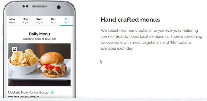 (image: https://www.peachd.com/)
- Easy to read. Font size, font selection, line spacing, website color palette, section arrangement, all affect readability. Desktop view, tablet view and mobile view all matter now.
Everything on the website should have ONE GOAL: to help audience browse through the website comfortably and get the information they need as soon as possible.
The example below gives the details for this condo. The website has the standardized format that you would know where the information locates in every property page.
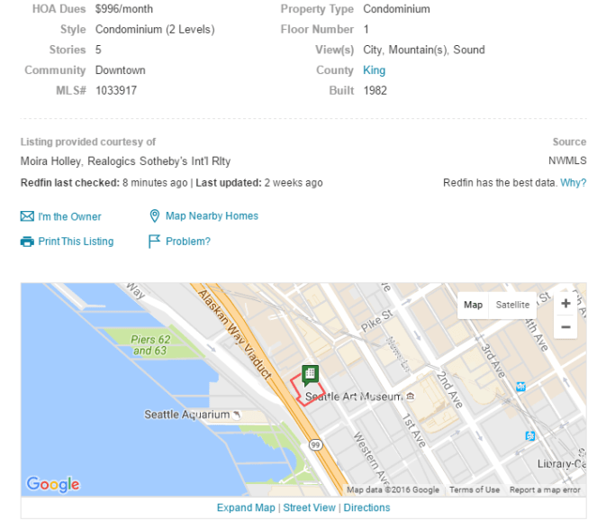
(image: https://www.redfin.com)
- Easy to use/navigate. Where to sign in, where to find the information the audience need, where to buy, where to pay, and where to go back to the main menu (I don’t remember how many times I got lost on a website) everything should be obvious even to the first time visitor.
The experience should be like you walk into your own bedroom in dark – you might get tripped by the books on the floor, but you know the direction and how far away.
It is about SEO too. Don’t never ever confuse Google. A structured navigation system will help Google know better about your website and serve results to your targeted audience.
Top navigation bar and side bar are very helpful for direction.

(image: http://www.impresscardsandcrafts.com/)
The main idea is if a new website I don’t need to think, I don’t feel frustrated, I get what I need during the amount of time I expect to spend, is a well designed website.
